
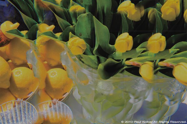
Image: for sale, limonata, (2010), inkjet and acrylic on canvas, a fracolor in twenty-four parts, 132″ x 198″
In 1973 Kolker, in his Long Island studio, began his pup/dnd… no matter how you look, it’s still a pup! series of sculptures of six puppies, each painted in the primary colors of his palette and black and white. Then, using the kaleidoscopic distortions made by lenses, prisms, mirrors and waffle-glass, he came upon the analog version of color fractionation or pixilation of the painted sculptures. In 1975 he put together the component parts of a satellite receiver and erected, with help, a dish antenna down linking broadcast satellite feeds to an Advent tricolor front end projector television. Kolker learned much about light optics while frequently calibrating the three color projector lenses by casting overlying grids on a parabolic screen to enable sharp focus, complex color generation and pixilation.
That Advent television, kept alive and resuscitated several times over more than twenty years, was the denouement of the artist’s voyage into our present digital era of television, computer and cell-phone screens which are the information technology symbols of our popular culture and of Kolker’s art.
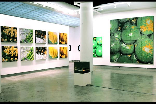
Color, color, everywhere…Go yellow! Go green!, 2010, installation views


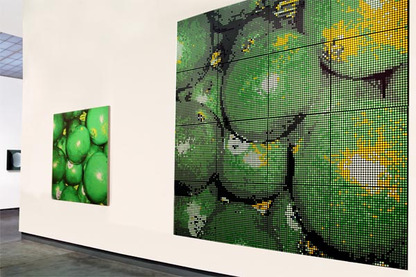
Kolker’s work is large scale, modular and repetitive in color, shape and form. He uses fractal graphics programs for design, illustration and photography creating dot grids, curves, loops, vector cuts, layers, and even color fractionation. Kolker’s methods are process-laden, but for a cardiothoracic surgeon, adherence to process is second nature! His palette (of primary colors red, green, blue and yellow which are never mixed with another color, except mixing color with black and/or white), create a gamut of primary color visual hues and their tints and shades. A grid of usually black or white circumscribes the colored dots, much like the sub-pixels of a liquid crystal display, plasma or LED screen or the phosphors of a cathode ray tube as viewed in a dark field. The background effects are expansive, particularly when color is surrounded by black. While using this principle, Kolker has created paintings which appear obscure from up close and highly defined when viewed from afar; high definition photographs which are pixilated with single colored dots of red, green, blue and yellow; and fractal boxes of LED lights, and sometimes images, all iterating ad infinitum. This process, which uniquely distinguishes his painting, photography and sculpture, he calls ‘fracolor’.
The show highlights twenty-three fracolor paintings and prints in yellow and green. In for sale, limonata, (2010), a fracolor in twenty-four parts, 132 x 198 inches, (a detail of which is depicted above), prismatic lens filters distort and dot grids iterate the elegance of the composition of a lemonade stand of fine crystal, silver, china, linen, lemons, honey and yellow tulips. Contrary to our expectation of plastic ware and paper napkins of the usual lemonade stand, both the aesthetic and concept of the still-life shout “fine!” as in fine art. Also showcased is green pomegranates, (2010), a fracolor painting in sixteen parts, 132 x 132 inches, about our perception of the fruit of the red colored species Punica granatum in an apparition of green. Certainly, with the unfettered imagination of artistic license, anything can be made to appear like what it is not. Although the form and the shape hollers “pomegranate”, the color does not. Is it a “tricking of the eye” like a painted mural, on a painted wall, of a balcony looking out to the rose gardens? …and you, with amazement, actually smell the roses! Or is it that you are a mariner on a voyage to an imaginary place of expansive color beyond the real, as in Coleridge’s metaphorical Rime, “As idle as a painted ship, Upon a painted ocean… Water, water, everywhere”?
Paul Kolker: Color, color, everywhere… Go yellow! Go green! — June 3 through September, 2010.