[September 22, 2011] Paul Kolker: Tints and Shades Redux is an exhibition of dot paintings, prints and light sculpture is about how color is perceived in relation to its presentation. In this show, Kolker explores the question of the aesthetic values of perceived color through new dot paintings made in his limited color palette, but in tints and shades painted on black, white or grayscale background fields.
Paul Kolker tints-shades-bezold-noir © 2011 Paul Kolker. All rights reserved.
Image above: tints and shades bezold noir, 2011; Image right: tints and sahdes bezold blanc, 2011
Kolker paints or prints dots of solitary color. His palette is minimal, consisting of red, green, blue and yellow; the physiological human vision colors. Although he adheres to the aesthetic purity of color unmixed with another color and painted in the shape of minimal geometric forms, he creates a myriad of tints and shades producing a gamut of pastel-like colors. Tints are colors mixed with white; shades, with black. Mixing with both black and white effects a grayscale. The resultant visual effect of painted dots in tints and shades is reminiscent of the eighteenth-century pastelists, who using crayons explored a faster and less expensive way than painting in oils to effect portraiture. The crayons were fabricated with colors mixed with chalk, lamp-black or combinations of black and white, also producing a grayscale of tints and shades.

Tints and Shades Redux, 2011, installation views

However, Kolker further developed his minimalist style of painting for other reasons besides his adherence to elemental colors and minimal shapes and forms. As far back as 1975, the alignment grid of his three color tube front end projector television became the root basis for his art. By zooming up close to the screen, the image appeared to be an abstraction of colored dots; while from afar it no longer appeared pixelated, but in fact it became a sharp, clear and more highly defined photographic image. Thus, parallax, that zoom apparatus of our digital age, and the television, computer and cell phone screens and their dot arrays have become iconic of Kolker’s works.
Like the pastel portrait artists who drew solitary strokes of color laid down next to the other or each over the other, creating a gamut of complex colors through optical color mixing, Kolker achieves a similar effect with his colored dots. His works are large in scale and modular. He uses fractal graphics programs to fractionate and deconstruct a photographic image into grids of dots, squares, lines, curves or loops. Using screen printing or plotter-scanner vector cuts he reconstructs the image into a painting of fractionated colors. A grid of black or white circumscribes the colored dots, much like the sub-pixels of a liquid crystal display, plasma or LED screen, or the phosphors of the cathode-ray tube as viewed in a dark field. In this manner he creates paintings which appear abstract up close and highly defined when viewed from afar; high definition photographs which are pixellated with dots of solitary colors; and light box sculptures using LED lights and images iterating ad infinitum. This iterative process, employing a reconstruction of fractionated shapes and color, Kolker calls ‘fracolor’ in attribution to Benoit Mandelbrot and his fractal geometry of repeating shapes and forms.

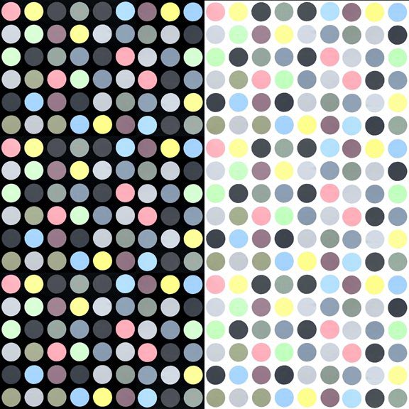
Depicted above are details of two large scale paintings in the show. To the left, tints and shades, bezold noir; and to the right tints and shades, bezold blanc. Each are painted with colors of identical mixing formulas, but one is painted on a black field and the other on white. Each produces a distinctive optical color mixing effect, as originally described by Wilhelm von Bezold more than a century ago.

Also, in the show of thirty works, are a series of ‘ishi eight’ dot paintings, (based on an Ishihara color vision chart testing the viewer’s ability to discern the number eight) in which the artist further explores the aesthetic as well as physiological determinatives of how we perceive color; and how some of us, mainly some men, are color blinded in distinguishing certain tints and shades of red and green.

Paul Kolker: Tints and Shades Redux — Opening reception September 22, 2011.